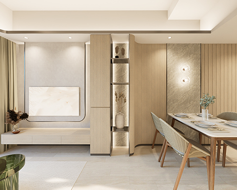
LOHAS PARK PHASE 11B VILLA GARDA I – 2 -Tseung Kwan O – Residential Concept
September 5, 2025
LOHAS PARK PHASE 11B VILLA GARDA II – 2 -Tseung Kwan O – Residential Concept
November 1, 2025
Victoria Court
Apartment, Causeway Bay
Interior Design for Victoria Court
In the densely paced urban core of Causeway Bay, residences often face a subtle contradiction: on the one hand, they enjoy highly mature living amenities, while on the other, they are easily surrounded by the bustle of commercial districts and high-density urban scenery.
However, this residence in Victoria Mansion possesses a rare inherent advantage—the view itself is already enough to become part of the interior design. Looking outward from the interior, Victoria Park fills the foreground, while Victoria Harbour stretches into the distance. At sunset, the changing colours of the sea and sky can be seen, and after nightfall, fireworks can be enjoyed; shifting the gaze further to either side also brings the Convention and Exhibition Centre, Central’s IFC, and West Kowloon’s ICC into view. In other words, this is not merely a residence with a “sea view”. It is more like an observation capsule suspended above the city. The designer’s real challenge was how to establish an interior world with an equally strong presence in the face of such an intense urban landscape. And so, a spatial experiment belonging to the future began.
When the Urban Landscape Meets the “Future Capsule”
Read More
The most distinctive design language of this project takes space, science fiction, and Cyber culture as its core concepts. This style does not stop at superficial “tech” decoration, but is gradually established through spatial contours, lighting, materials, and even the way collections are displayed. Upon entering the living and dining area, the first thing that catches the eye is the sense of movement in the lines. Wave-pattern stainless-steel ceilings, curved-edge rounded light troughs, and an abundance of curved furniture and glass elements collectively soften the right-angled framework commonly found in traditional residences. The space no longer resembles a static box made up of walls, ceilings, and floors. Instead, it feels more like a spaceship in motion. Especially when the lights come on, blue ambient lighting gradually emerges along the display cabinets and spatial details, giving the originally austere metal materials another kind of cinematic light-and-shadow effect. The blue here is not simply a theme colour. It is more like the space’s “ambient light”. Flowing between different positions and levels of brightness, it creates layers across the furniture, cabinetry, and metal surfaces, while also allowing the entire residence to present completely different expressions during the day and at night.
Making the Collections the Protagonists of the Space
For those who love collecting, displaying models is often more important than simply increasing storage capacity. The homeowner owns a large number of Figures and collectible models of various sizes, so the designer did not treat them as ordinary household items, but formally incorporated the collections into the spatial design. A large number of curved glass cabinet doors and glass display cabinets allow the Figures to become part of the interior landscape. The use of transparent materials is particularly important. It neither encloses the collections within heavy cabinetry, nor prevents lighting from creating layers between the models and their backgrounds. When blue light shines through from inside the cabinets, the silhouettes of the character models, metallic details, and glass reflections overlap with one another, so the collections are no longer merely “things placed inside cabinets”, but become important elements that shape the atmosphere of the space. This approach is actually highly consistent with the core spirit of science-fiction aesthetics—technology is not displayed, but integrated into life.
Dark Flooring Creates a Sense of “Weightlessness”
If the ceiling and cabinetry are responsible for establishing upward visual tension, then the floor becomes another key element of the entire space. The designer selected dark glossy floor tiles, deliberately making use of the reflective properties of the material to mirror the light and shadows of the ceiling, lighting, and cabinetry onto the floor. As a result, the floor is no longer merely a plane supporting the furniture. When the interior lights come on, the light and shadows above and below echo one another, and the floor seems to lose its original physical boundaries, creating a visual effect that extends downward. Walking through it feels like being in a space without clearly defined upper and lower boundaries. This is precisely the sense of “zero gravity in space” that the designer hoped to create. And the reason this effect works is not because a large number of science-fiction symbols have been added, but because the relationship between light, reflection, and materials allows people to genuinely feel a change in the state of the space. This is also one of the more intriguing aspects of the project: the sense of science fiction does not come from “form first”, but is gradually built up through the physical properties of the space.
Redefining the Three-Bedroom Layout for Collections and Living
Beyond style, another important design proposition of this project was to rethink how the original three-bedroom unit should be used. Although the original layout provided three rooms, it did not necessarily fully meet the homeowner’s actual lifestyle needs. After understanding the homeowner’s living habits and collecting interests, the designer did not simply pursue the “number of rooms”, but redistributed the functions of the space. One of the rooms retained roughly its original size and was converted into a dedicated study. This is not merely a workspace. It is also the homeowner’s private domain for reading, working, and assembling models. Therefore, the designer continued the science-fiction language of the living and dining area, using curved lines, lighting, and futuristic materials to shape the atmosphere of the space. When the homeowner sits at the desk to work, or spends time slowly assembling models, the scenes of daily life naturally overlap with the design theme. The study is not merely “a room”, but the homeowner’s own private space capsule.
Turning the Walk-In Wardrobe into Another Collection Display Space
The other room connected to the master bedroom was replanned as a walk-in wardrobe. This change may appear simple, but in practice it further improves the functional logic of the master suite. The designer added a tall glass display cabinet in the centre of the walk-in wardrobe, making the collections the visual focal point of the space. The most interesting aspect of this arrangement is that it does not completely separate “storage” from “display”. Even while changing clothes, the homeowner can admire their treasured collections through the transparent glass. The walk-in wardrobe therefore ceases to be merely a functional room for storing clothing, and becomes another visually engaging space within the master suite. From work and collecting to everyday living, the homeowner’s interests are fully woven into the residence. This also reflects an increasingly important direction in modern residential design: A truly high-quality space does not force life into a design, but allows the design to grow out of life itself.
When Storage Disappears, the Master Bedroom Becomes Even More Grand
Since the walk-in wardrobe already handles the main clothing storage needs, the master bedroom no longer requires large storage cabinets. The designer simply returned the visual focus to the bed. A generously sized master bed is placed at the centre of the space, with no excessive cabinetry obstructing it, giving the entire room a more open and complete visual effect. In terms of materials, distinctive green marble paired with brass elements adds a layer of luxurious texture to the otherwise cool-toned science-fiction theme. The natural veining of the green marble contrasts with the lustre of the brass surfaces. On one side is the naturally formed texture of stone, while on the other is a metal with an artificial, technological quality. These two seemingly completely different vocabularies, when placed together, instead create a distinctly contemporary balance. The master bedroom therefore does not continue the intense lighting effects of the public spaces, but lets the materials themselves speak. The public spaces resemble a future capsule, while the master bedroom is like a private suite within the capsule.
Using “Subtraction” to Create a Larger Master Suite
The bathroom design also underwent corresponding spatial reorganisation. The original guest bathroom featured a double vanity, but after discussion with the homeowner, it was considered that this configuration had a relatively low actual usage rate, so part of the space was reallocated to give the master bathroom more room. This is a fairly typical yet easily overlooked approach to residential design: Spatial planning is not about “keeping whatever was originally there”, but reassessing what is truly worth keeping. When unnecessary functions are removed, the living spaces that genuinely matter can be enhanced. At the entrance to the master bathroom, the designer also continued inT Design’s signature expertise in sliding-door treatments, specially designing a large double sliding door. When both doors are opened, the boundary between the master suite and bathroom is further softened, naturally creating a more complete and spacious visual effect. This treatment is not simply about pursuing the grandeur of a “large door”, but about using an operable interface to alter the sense of space. When the door is closed, it is an independent and complete bathroom; when the door is open, it becomes part of the master suite. A single door can change the perceived scale of the entire space.
Creating a Universe of One’s Own Amid the Bustle
Causeway Bay has never been a quiet city. Victoria Park, Tin Hau’s food streets, the Central Library, and Queen’s College all offer highly concentrated living amenities; beyond them lies Hong Kong’s urban skyline formed by Victoria Harbour, the Convention and Exhibition Centre, Central’s IFC, and West Kowloon’s ICC. But the most captivating aspect of this residence is precisely that it has not been swallowed up by the city’s bustle. Instead, the designer transformed the area’s characteristic of being “bustling yet tranquil” into part of the interior design. Outside the windows is one of Hong Kong’s most iconic urban landscapes; inside is a future world constructed by the homeowner. During the day, sunlight and the sea view become the residence’s largest canvas; as the sun sets, the colour temperatures indoors and outdoors gradually shift; when night falls, the blue lights come on, and glass, metal, and dark floor tiles begin reflecting light and shadows. At this moment, the IFC, ICC, and the nightscape of Victoria Harbour outside the windows echo the Cyber aesthetics indoors. The boundary between the city and the residence instead becomes blurred. Perhaps this is the most admirable aspect of the project. It does not attempt to “overpower” the view outside with interior design, nor does it deliberately pursue the opulence of a traditional luxury residence, but instead creates an interior universe that exists in parallel with the cityscape.
Outside the window is Hong Kong, inside is the future.
And the true sense of luxury does not simply come from size, views, or expensive materials, but from the moment a space can respond so completely to the personality, collections, and lifestyle of its occupant, the residence truly becomes a home that “belongs only to this person”.
If you want to know more about this interior design idea or other project designs, please visit our Youtube Channel and watch for more videos.