One Silversea
Apartment, Olympic Station
Interior Design for One Silversea
The One SilverSea apartment near Olympic Station has a sea view, high ceiling, grand windows, and a spacious interior, offering an excellent opportunity for the designer to weave his magic. The designer's concept provides tremendous value to the unit. The walls from the house door to the living and dining rooms are decorated with grey mirrors, white cabinets, shelves, and grey fabric wallpaper to form one set of storage lockers under one theme. The large-scale layered installation stretches all the way to the sea view out of the window, and just like a nicely choreographed stage play where every step leads to a new scene, our residential interior design makes it a great home with marvellous views.
Read More
Developing a Theme Wall
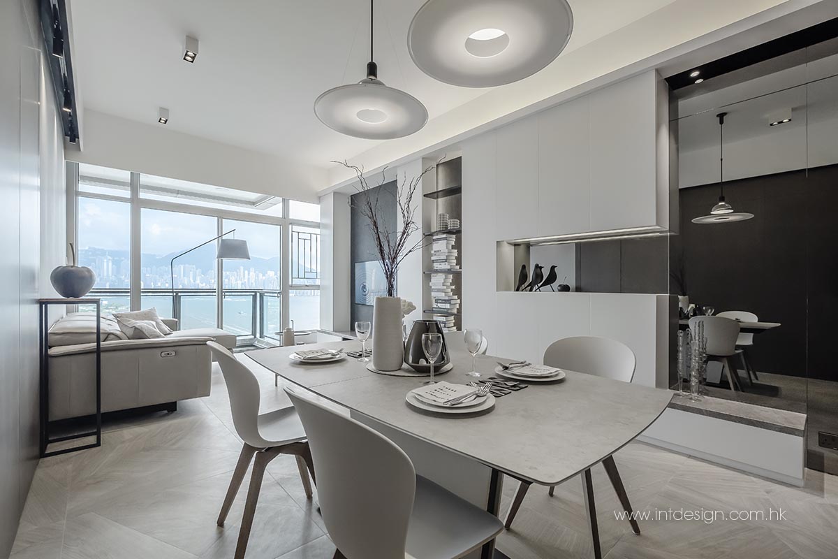
What is special about this residential interior design? Once you enter the house, you will see a wall of grey mirrors by the entryway, creating the illusion of space and brightening up the passage. It also allows the homeowners to check their clothes before leaving home. Next, the most incredible part unfolds. Designer Jacky conceived a collection of cabinets that connects the living and dining rooms, that is, to join the storage locker seamlessly with the wall-mounted TV cabinet. The cabinet set begins with a base cabinet that sticks out like a small platform. Anyone can sit here to change shoes, get shoes on, and stand up to look in the grey mirror to groom themselves. And when on holiday, you can put Christmas trees or flowers here. Surely you will think of beautiful uses for this.
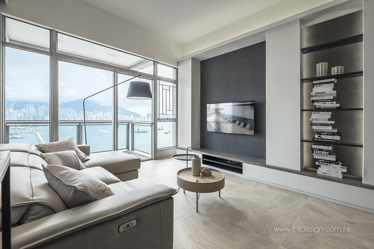
Next to the base cabinet is a set of white C-shaped lockers. The transparent, recessed boxes are to place decorations or anything at hand. A grey mirror is installed inside at the back, combined with the same colour as the one at the entrance. The C-shaped cabinet is connected to the TV wall through a column of charcoal grey lacquer shelves covered by grey fabric wallpaper, the same as that glued on the TV wall, to make the room cohesive. And on each side of the TV wall stands a vertical, rectangular locker with a beautiful arched top, making the TV look like it’s extruded into the third dimension, while the dark grey fabric wallpaper on the TV wall creates a theatre atmosphere. The final part of the entire cabinet set is a rectangular marble base cabinet that echoes the first base cabinet. The residential interior design manages to keep diverse elements in harmony with the irrationality of the depths and creates visual flow with furniture on a theme wall.
Defining Theme Colours
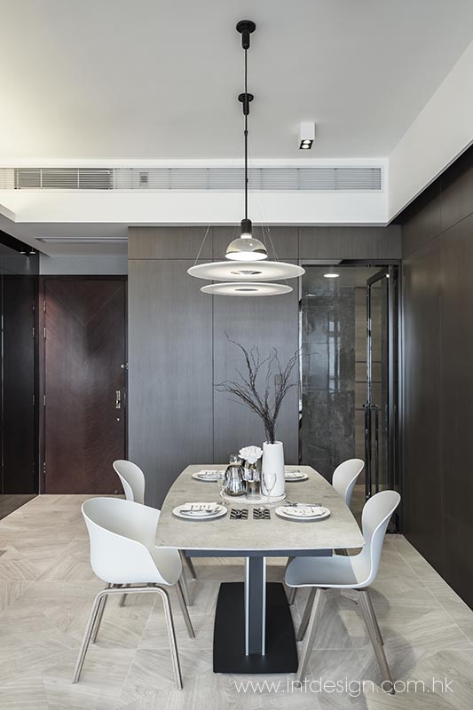
There is also a cohesive theme wall in the dining room, which features a walnut colour palette. The dining room is next to the kitchen. The owner wanted the kitchen to be somewhat extended. Therefore, the residential interior design Hong Kong team moved the kitchen door a bit forward into the dining room, replaced the original door with a grey steel-framed glass door, and used the extra space to position the refrigerator. The protruding corner is covered by a shoe cabinet that lengthens the entryway. The walls from the entryway to the shoe cabinet, as well as cabinet surfaces, are all decorated with walnut wood panels, under which the entrance to the corridor is concealed, improving visual simplicity and unity.
Although the ceiling is high, Hong Kong interior design consultant Jacky doesn't want to add more details to it except the chandeliers hanging in the dining room for fear of destroying the atmosphere of space. Therefore, it only uses a trough light on one side and a spotlight on the other side to provide lighting in the living room. And in this residential interior design plan, the air conditioning system is also hidden in the ceiling troughs, only leaving clean ceiling lines.
Pulling the Rooms Together
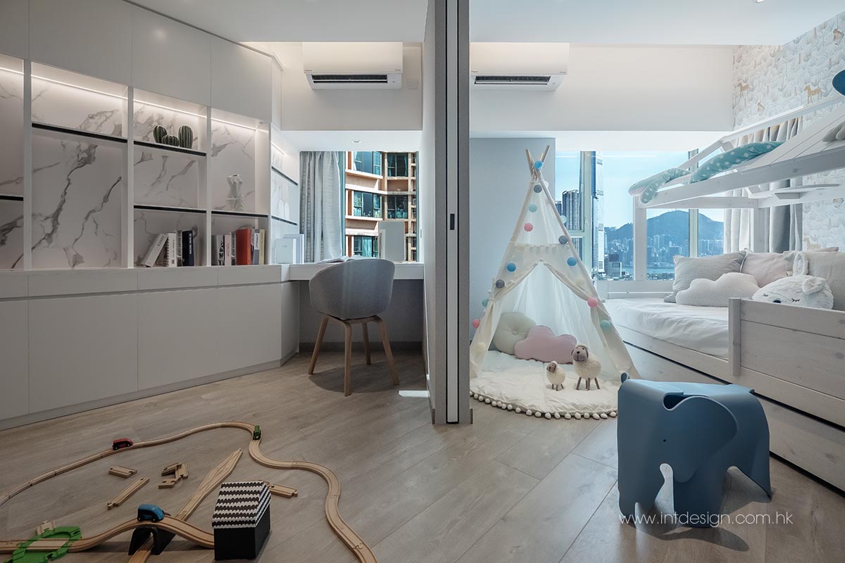
The first and second rooms along the hallway belong to the owner's sons and daughters, respectively. The daughter loves white, so her room is a simple white theme with only a touch of pink. Her room is not huge. The residential interior design team has persuaded the girl to use a loft bed so that they could fit a long, wide desk under the bed. And a bookshelf is placed behind the bed by the window rather than on the desk, which may make the space appear cramped, but now, it's much more comfortable. Fortunately, the ceiling is relatively high, and the girl doesn't need to worry about hitting her head when on the loft bed. The space under the bed can also contain a large wardrobe, and the window sill will be a comfy seat for the girl.
At the same time, the boy's room uses a floor-standing bed without the bed screen to leave more space and prevent feeling claustrophobic. His room's furniture is white, and the walls consist of grey wallpaper, plus a wardrobe and a large desk. Above the desk, you can see a white suspended bookcase, which hangs a black iron-framed panel. It is worth noting that this black iron frame also appears in the daughter's room, on the bed rails and desk legs. Although each room has its style, Jacky said some common elements in residential interior design would make them more cohesive and unified rather than separated.
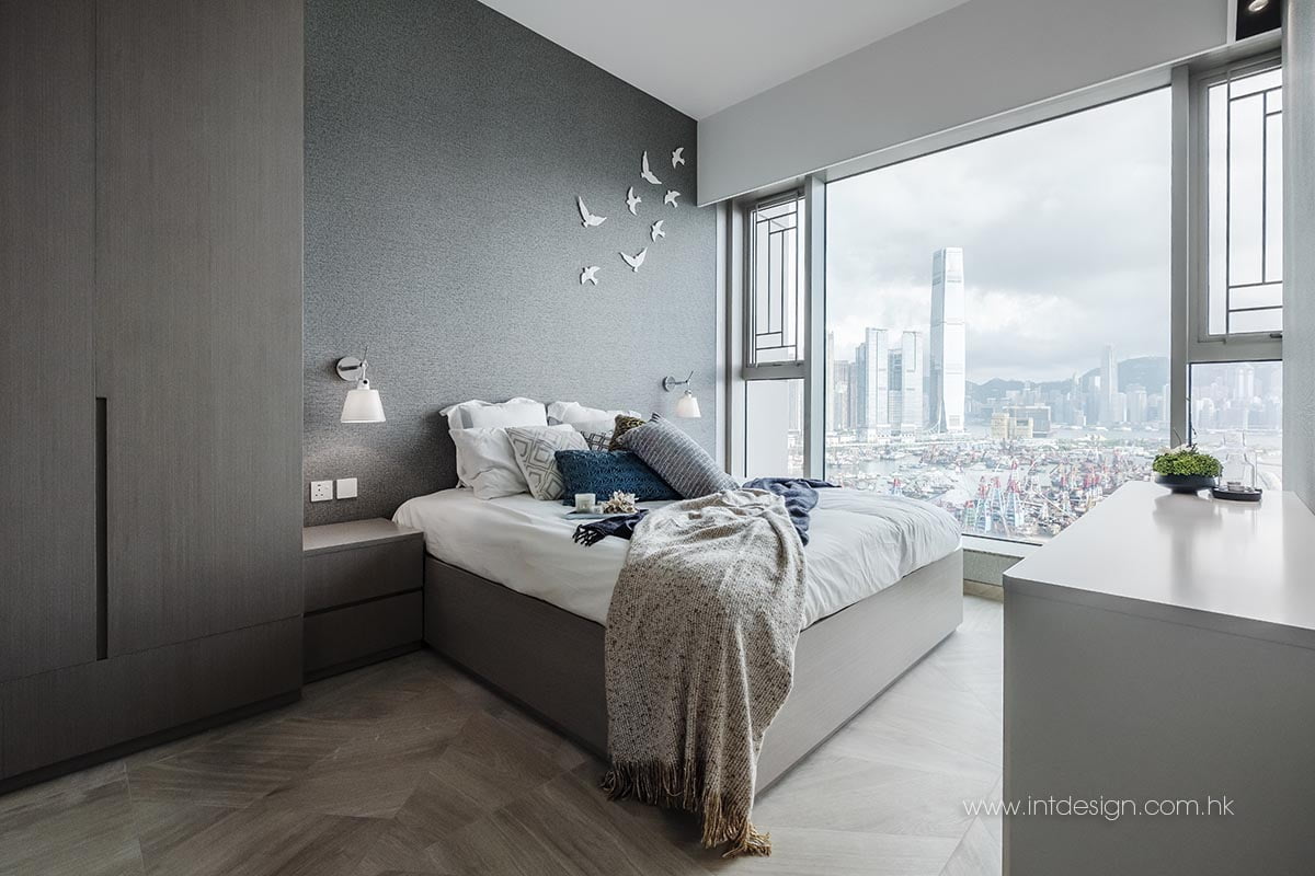
In this residential interior design scheme, the primary bedroom has been slightly enlarged as requested by the owner. The closet space is maximised. Both wardrobes are decorated with walnut veneer, the same with the bathroom door between the two wardrobes, so you can barely see the door. Again, the same colour is used to conceal the hidden door and HVAC ceiling, so they blend together and differentiate themselves from the sleeping zone. The bed does not have a screen, the purpose of which will be served by the grey fabric wallpaper, and which shows white silhouettes of flying birds, making the space quite dynamic and exciting.


