The Harbourside
Apartment, Kowloon Station
Interior Design for The HarbourSide
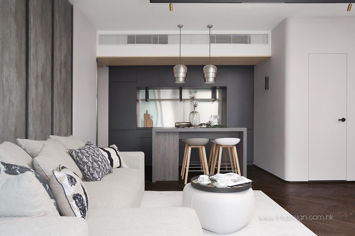
Ruling over Elements alongside The Cullinan, The Arch, and Sorrento, this spacious flat in The Harbourside had three bedrooms in its original layout, which was more than plenty but less than helpful for its young and single propriétaire. She needed something tailored for her lifestyle, and that is exactly what our interior designer Jacky granted her. Removing extraneous partitions and expanding the living room instantly simplified the floorplan, and a cloakroom for storing shoes was erected to make better use of space. The apartment was refurbished under a simplistic but multi-layered design with a black, white, and grey colour scheme, which drastically elevated its functionality and visual presence.
Read More
Combining Storage and Protection at the Entrance
The pandemic has invigorated our need for a clean and safe home. Intending to streamline the disinfection process and prevent viruses from entering the apartment, Jacky, our interior designer, transformed the original maid’s room near the entrance into a cloakroom that could assemble the young madam’s collection of shoes, coats, and bags. He also made room for a tall cabinet to store disinfection supplies and a chair for her to sit and put her shoes on. The room’s concealed sliding door can be opened or closed to achieve ventilation or seclusion without interrupting the space or the user.
Living alone – Fewer walls, More Freedom
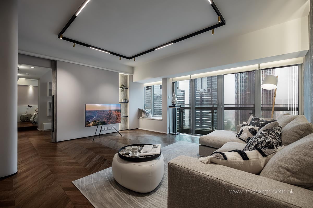
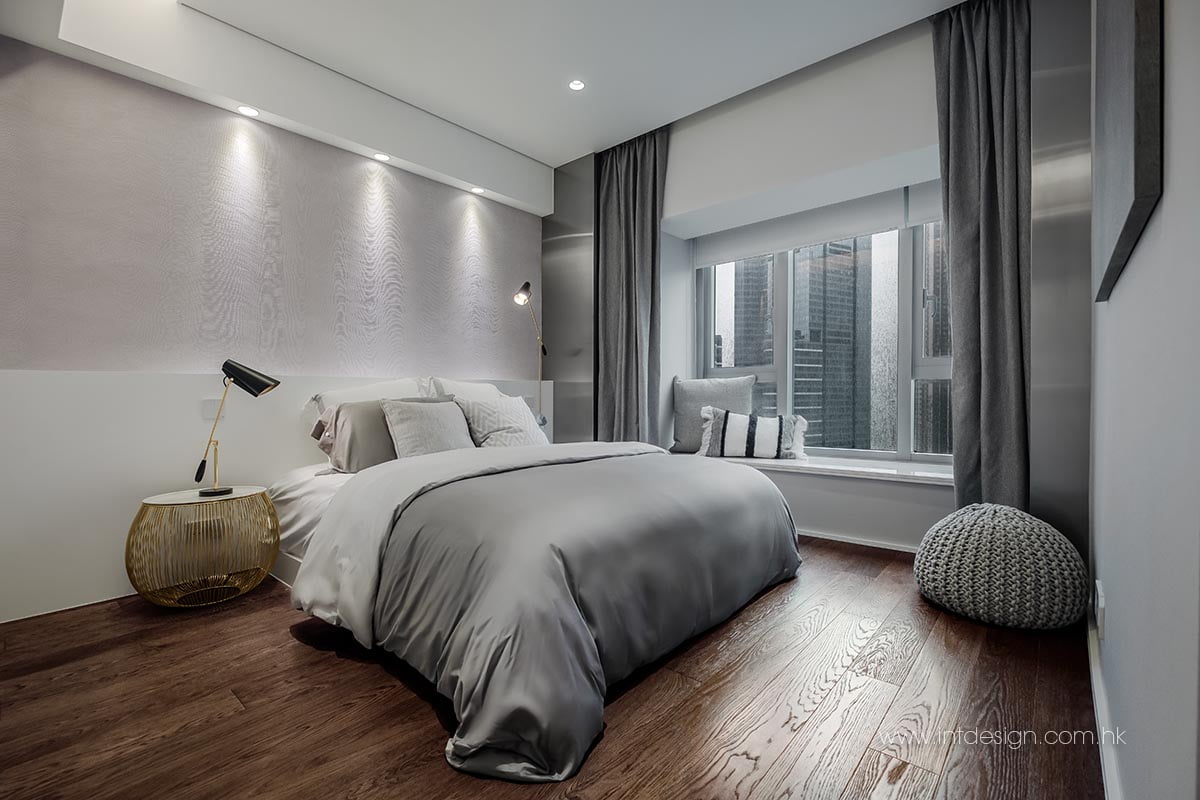
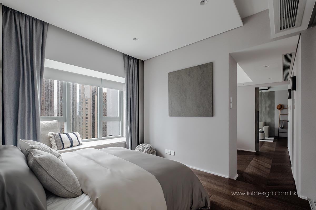
The original three-room layout created unnecessary barriers for our young and single client, who would otherwise benefit from fewer boundaries and thresholds. To achieve this, Jacky made bold amendments to the existing study. By tearing down a wall that enclosed it from the hallway and removing the door that disconnected it from the master bedroom, he blended the three entities into a larger fluid space that allowed both light and the user to pass through seamlessly.
The young mécène also enjoyed exercising at home. One of the underutilised rooms near the parlour was disintegrated to suit her need to enlarge the study and the living room. The extra space meant that she no longer had to move furniture around before starting her activities. Tailoring to her habit of playing Youtube videos during workouts, Jacky enclosed the living room’s borders with the entrance using a metal-framed glass door that added a layer of sound insulation and privacy without interrupting visual coherence.
Simplistic But Nothing Simple – Coupling Minimalist Design with Layers of Detail
Jacky had already earned the client's trust from a previous project and enjoyed enormous freedom to explore the depths and possibilities of spatial design. His client was keen on avoiding genericism – she wanted a home that felt different from Hong Kong but didn't overdo itself with fanciness and cliches. The design needed simplicity but couldn't be boring.
To achieve this, Jacky turned his focus to crafting details that would entertain her taste. Upon arriving at the entrance, the abyssal depth of design is instantly noticeable. The ceiling of the slender entryway was covered by rivers of thin, balmy wooden strips that spilt light from the side and added a unique warmth to a monochromatic space. This texture and pattern, along with the extensive use of curvature in the overall design, led the guests' eyes towards the centre of the loft. Round edges on walls, chairs, mirrors, and washstands created a visual cue that was welcoming for its guests and calming for its occupant.
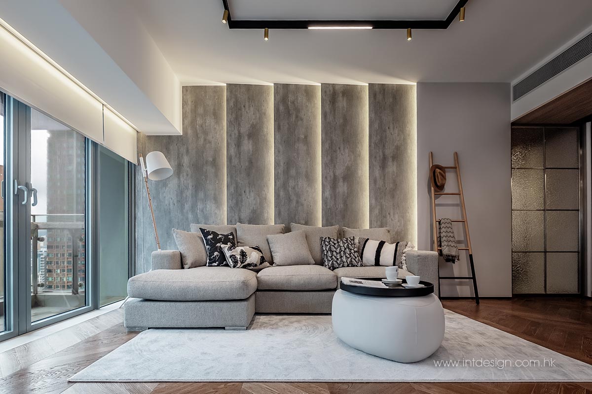
In the parlour, all eyes are drawn to the statue-like wall behind the sofa. Monolithic concrete blocks stood diagonally aside one another to form a brutalist wall that leaked light from all its edges. The atmosphere is serene, but your eyes will notice a world of details. The skirtings were concave with thin edges. The walnut floorboards carefully assembled a timeless chevron pattern that required tremendous skills and craftsmanship. A combination of 24K track lights hidden in the ceiling and walls provided luminosity and allowed flexible changes in the atmosphere for this adaptive and multifunctional space.


