Tierra Verde
Apartment, Tsing Yi
Interior Design for Tierra Verde
Minimalism should not be boring; even a grayscale colour scheme does not always have to feel cold. For this three-room apartment in Tierra Verde, our interior designer focused their attention on the distribution and proportion of space and colour usage to achieve the beauty of Scandinavian minimalism while retaining maximum functionality on both a macro and micro level. This simple and stylish design adapts seamlessly to both social gatherings and more intimate settings to suit perfectly the lifestyle needs of the hospitable couple who occupies the apartment.
Read More
Enhancing the kitchen space with a reinvented floorplan
Our clients rarely worked at home. Instead, they often invited friends over for wine parties and dinner gatherings. The study was underutilised, and a larger parlour would be much more suited for their use. Our designer dismantled the first room along the hallway and granted the extra space to the living room. Then, the dining area relocated next to the room’s expansive windows to enjoy a stunningly extravagant view. An expandable dining table that sits six to eight people was chosen for its malleability, and a long and narrow storage bench was added along the window to provide extra seating options. “The guests would usually stay inside the bar and the dining area, so a three-seat sofa was more than enough for the lounge”, our interior designer explained, “But we did choose a larger, 68-inch TV, this way everyone could enjoy an exciting football game or TV show together no matter where they sat or stood in the living room.”
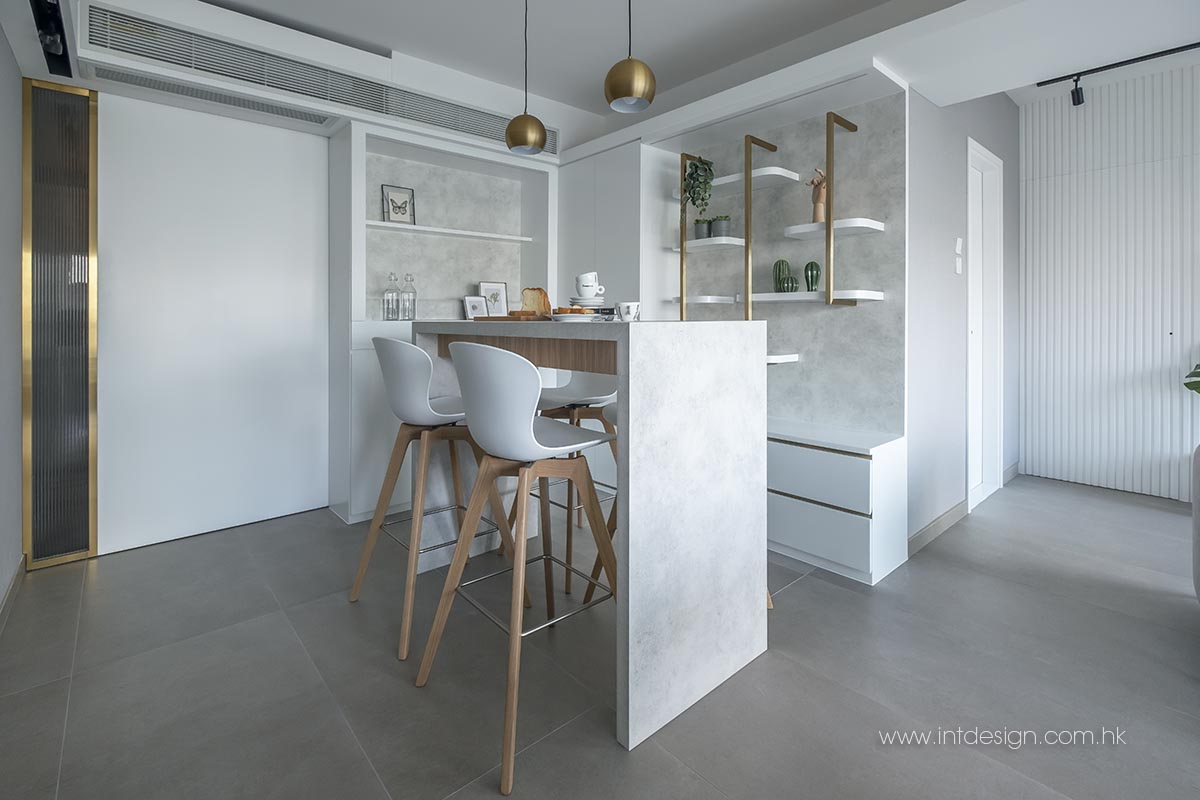
With the dining area moved closer to the window, the space it used to occupy could now be transformed into a cosy bar area. A metallic wine rack is mounted to the wall to display the hosts’ proud liquor collection, and a narrow bar table with two chairs on each side allowed friends to enjoy long conversations in an intimate atmosphere. When old friends meet, loud cheers and noisy laughter are undoubtedly unavoidable. Our designer added a solid, wooden sliding door to close off the bar from the kitchen and limit the travel of sound and smoke between the two spaces.
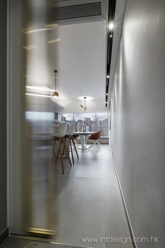
The residents didn’t cook often, but their extensive collection of appliances and unwavering commitment to hospitality called for a larger kitchen. An indispensable load-bearing wall made it difficult for expansion, so our designer drew space from the lobby area instead. The floor tiles in the two rooms shared the same washed-granolithic finish and became visually as one. The aforementioned wooden sliding door sat directly across from the apartment’s entrance. It added a layer of privacy during deliveries or when the gate is left open while taking out the trash.
Creating layers of warmth with just black, white, and grey
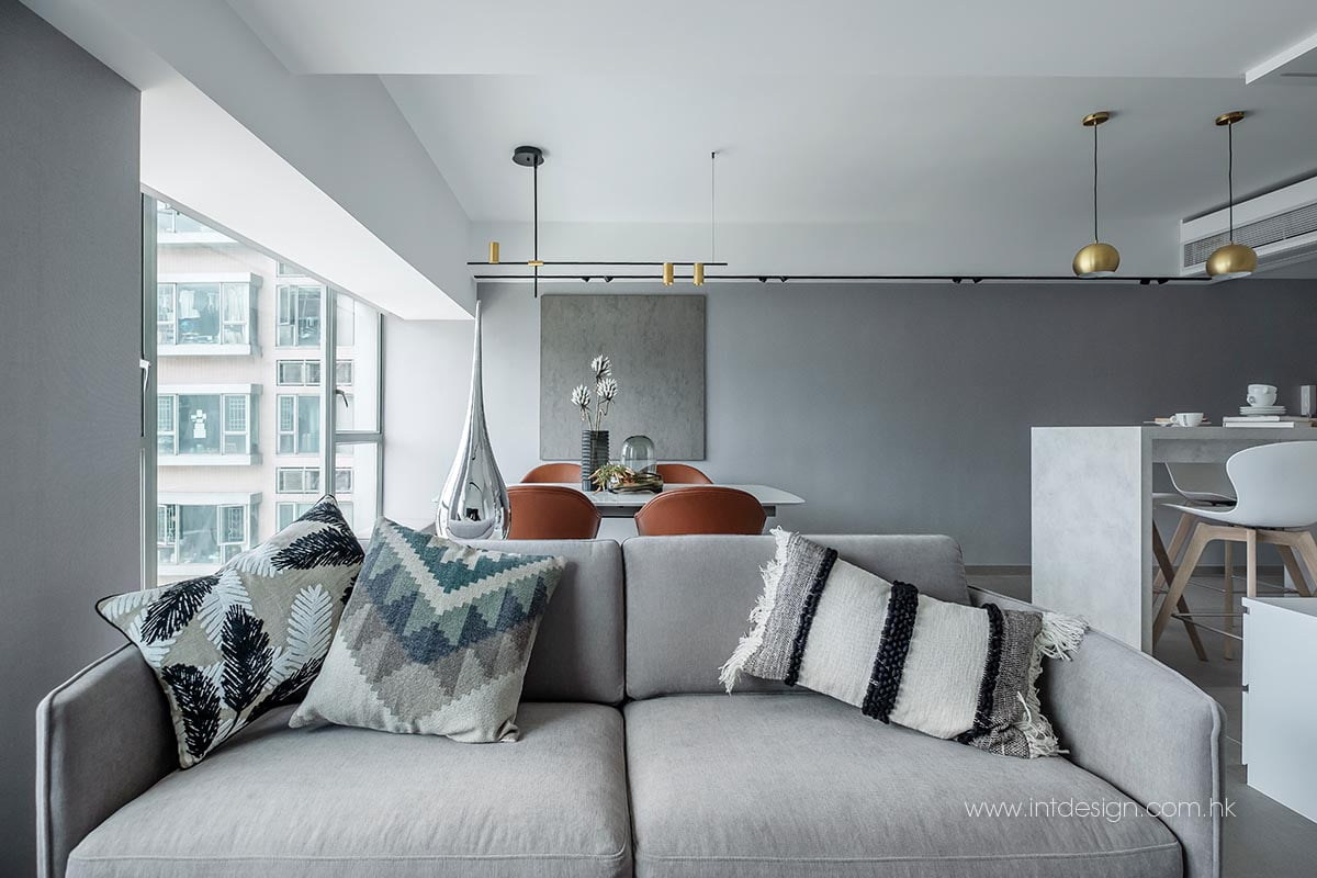
The colour scheme centred around black, white, and grey under the client’s request. These three shades might seem easy to match but are more often misused. The living room utilised different shades of grey and white on its walls to create depth and variation.
“The first thing we considered when choosing the colour of a wall is its proportion to the overall space and the source of light. The wall behind the TV, for example, is relatively narrow. A white wall with grooved texture can conceal the door next to the TV and make the living room feel much wider and more spacious.”, Our interior designer explains.
The cement-coloured wall in the living room also acted as a memory board for hanging precious photos as the residents loved to travel and take pictures.
A ton of work was put into coordinating the light, furniture, and material, as a grayscale colour scheme often led to a cold, one-dimensional atmosphere. “Black, white, and grey remained the core colours of the living room, but elements of wood and marble in the bar and the cabinet added warmth and depth to the visual presentation of the room.”, said our interior designer.
In addition, a light trough that extended across the living room utilised eight downlights to scatter beams in a way that brought about an extra element of liveliness and energy. The metallic texture of the pendant light, the sliding door, and the wine rack all added elegance to the equation. The designer also chose brown leather dining chairs from BoConcept to contrast the surrounding environment.
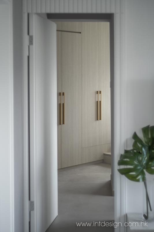
Delving deeper into the apartment, the designer used a connecting-room layout to organise the master bedroom. The madam’s cloakroom was on the right side. Inside was a cabinet with reeded glass doors that allowed for a modest presentation of her purses and could be used as a mirror. As we progress into the bedroom, there is a noticeable increase in the use of timber. The grey wall panels complement the ash wood closet and wooden platform to bring out an intimate and warm tone. As a finishing touch, the metallic wall lamps and handles act as shiny details that accentuate the elegance of the overall design.


